European Bus Maps: the State of the Art
February 2017
This article was originally published as a guest post on transit guru Jarrett Walker's professional blog Human Transit
The notion that Europe has superb public transit does not always extend to the quality of public transit maps. I have studied more than 250 European cities and their bus maps, and have also designed a few. Here are some observations about the state of the practice.
All transit maps fall within two main categories: geographic maps that show the real scale and distances, and schematic maps that help you see the network structure. Some cities use geographic maps, some use schematic maps and some use both of them. The choice is up to each particular city, there is no national preference or link with population size or urban shape. Some tendencies appear though; in the South of Europe (Italy, Spain), geographic maps are predominant while Scandinavian countries and Switzerland prefer schematics. French and German cities tend to employ both.
Transit maps, both schematic and geographic, can be grouped into 3 distinct categories, depending on the primary meaning of color.
- Color for technology: These maps use one color for trams, another for buses, etc.
- Color for lines: Color is used to help you trace different lines through the network.
- Color and width for frequency: Color and width help you identify high-frequency services, so that they stand out amid the complexity of less frequent services.
Color-for-technology
These maps assign a limited number of colors to each transport subsystem (bus, tram, metro) and do not separate single lines one from another.
With this kind of map, you can tell which street is used by public transport and which is not, as well as where the stops are located. It shows the space occupied by the network inside the urban territory but doesn’t tell the traveler how the network functions. With such a map it is difficult to plan even the simplest journey as you need to search for consecutive line numbers along a route. Complex journeys with transfers are next to impossible to plan.
Surprisingly enough, a lot of cities publish such useless maps, failing to inform the users about the real potential of the network.
I can only speculate as to why they do so. Perhaps they just do not care, and showing that the network exists and covers the entire territory is enough politically. Maybe they fear that showing the exact state of the network will reveal inconsistencies and provoke resentment or demands from citizen. Or, it may simply be that they consider the network to be too complex to be shown otherwise.
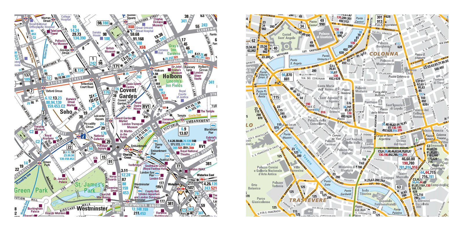
Color-for-technology in a geographic map: London and Rome
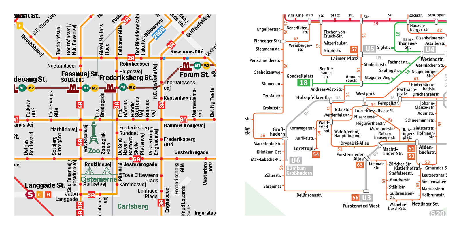
Color-for-technology in a schematic map: Copenhagen and Munich
Color-for-line
These maps assign each line a particular color. You can therefore easily follow a line’s route from end to end, without any ambiguity or confusion. Seeing each line separately enables a traveler to visualize complex journeys with several transfers or modal changes. Instead of sticking to the one line you know best, you can plan an onward journey different from the backward one. Unlike monochrome maps, a multicolored bus map doesn’t show a territory occupied by public transport but a network of lines and their stations with all its details and potential journeys.
It works even with very complex and dense networks such as Paris even though the legibility hits a limit in some very crowded areas where more than 10 lines share the same street segment.
A major weakness of a standard multicolored map is the egalitarian representation of all lines which can be misleading when they differ substantially in frequency. If you are on a line that runs every 30 minutes but there’s a useful line nearby that’s every 5 minutes, you’d never know from these maps.
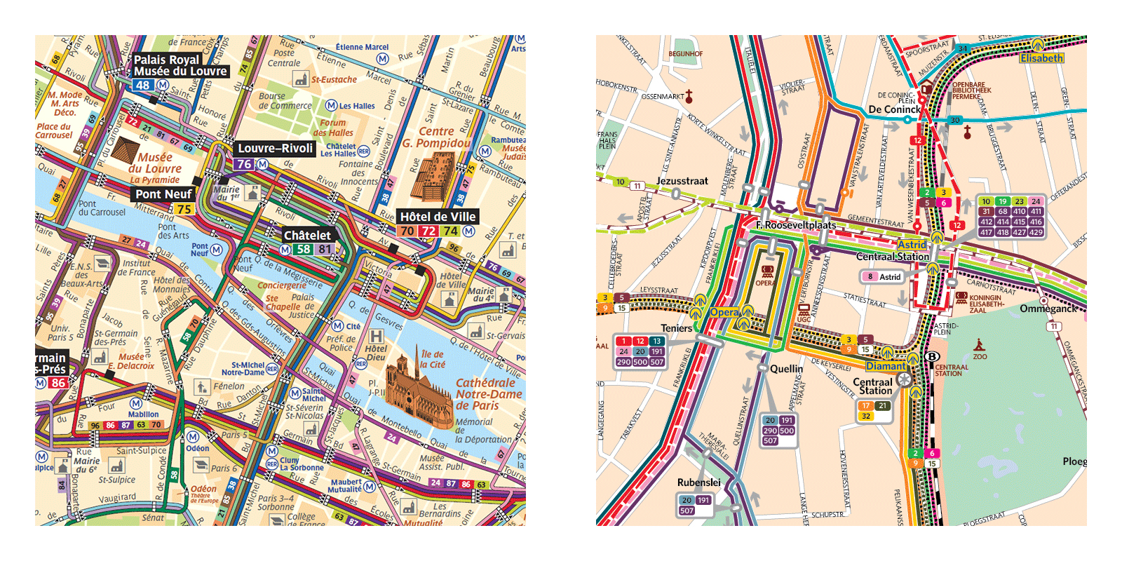
Color-for-line in a geographic map: Paris and Antwerp
Color-for-line in a schematic map: Brussels and Zurich
Frequency Maps
The problems of the previous two styles of map are addressed by frequency mapping.
Not only does it single out lines and show the network, but it also assigns to each line a frequency marker, usually a difference in width or color, which instantly differentiates lines with frequent service from lines with less frequent service. This makes it possible to avoid long waiting times. These new maps seem to illustrate a change of perception of the network, both by the operators and by the users. A general shift in working time and communication access has transformed the simple commute to work into a much more complex web of journeys. A frequency map is an information tool that enables such a complex travel pattern and also serves as a communication medium between the operator and its users. It can also assist people in choosing places to live so that they will have access to good transit.
As of today, European frequent maps are found in 5 clusters in Europe: Slovakia, Scotland, France, Germany and Benelux.
Slovakia: Bratislava, Kosice
Slovakian maps indicate a difference between Main lines and Secondary lines, with a difference in thickness and color. One can guess that Main lines are more frequent or faster than secondary lines but the legend doesn’t state it clearly.
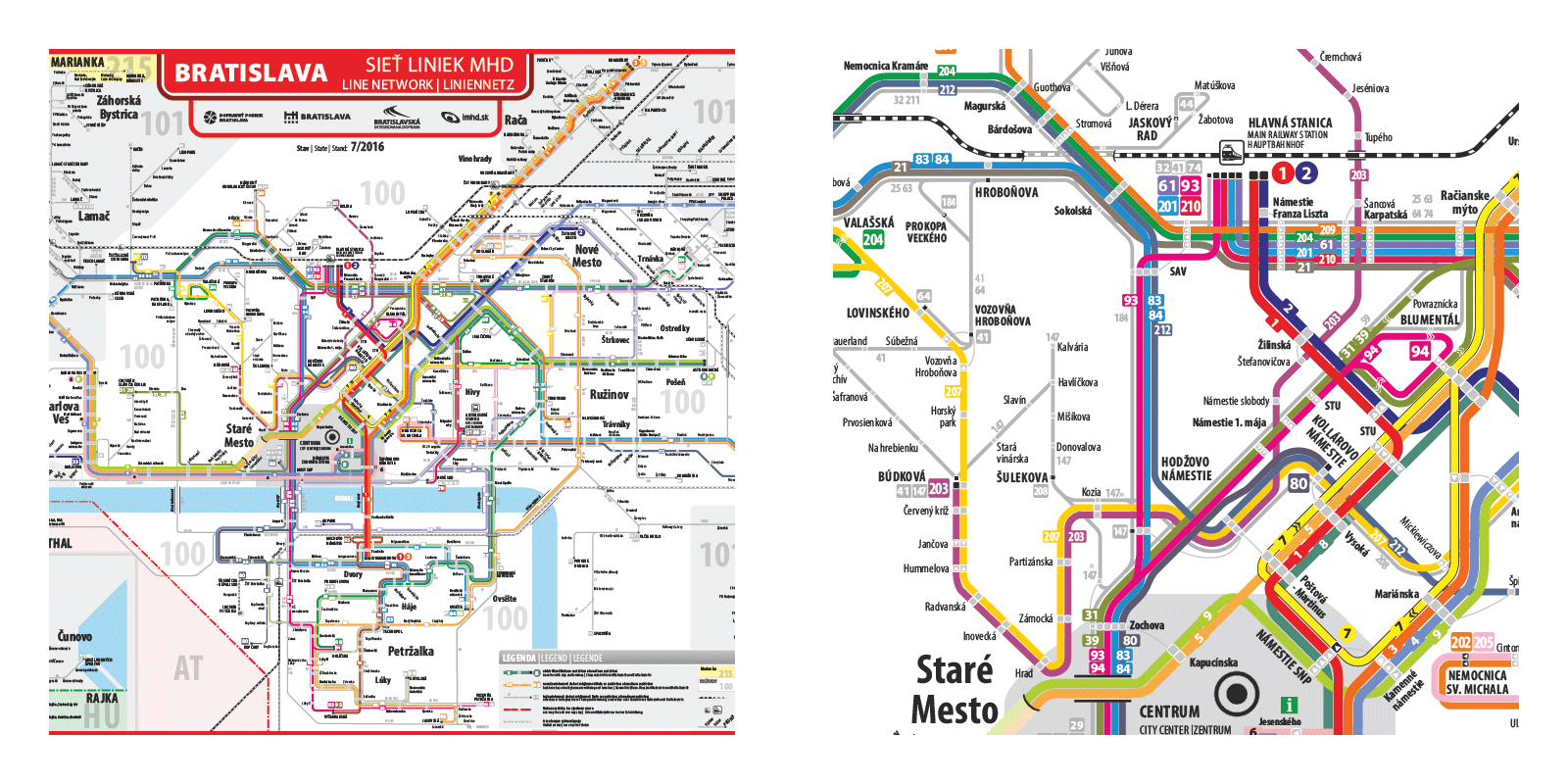
Main lines map: Bratislava
United Kingdom: Edinburgh, Glasgow
In Scotland you can find some real frequency maps where lines are strictly classified as frequent or less frequent. Unfortunately both the Glasgow and Edinburgh maps suffer from 2 limitations: the bus stops are not indicated and the city center is shown only on a separate inset, leaving the most important part of the network blank on the map.
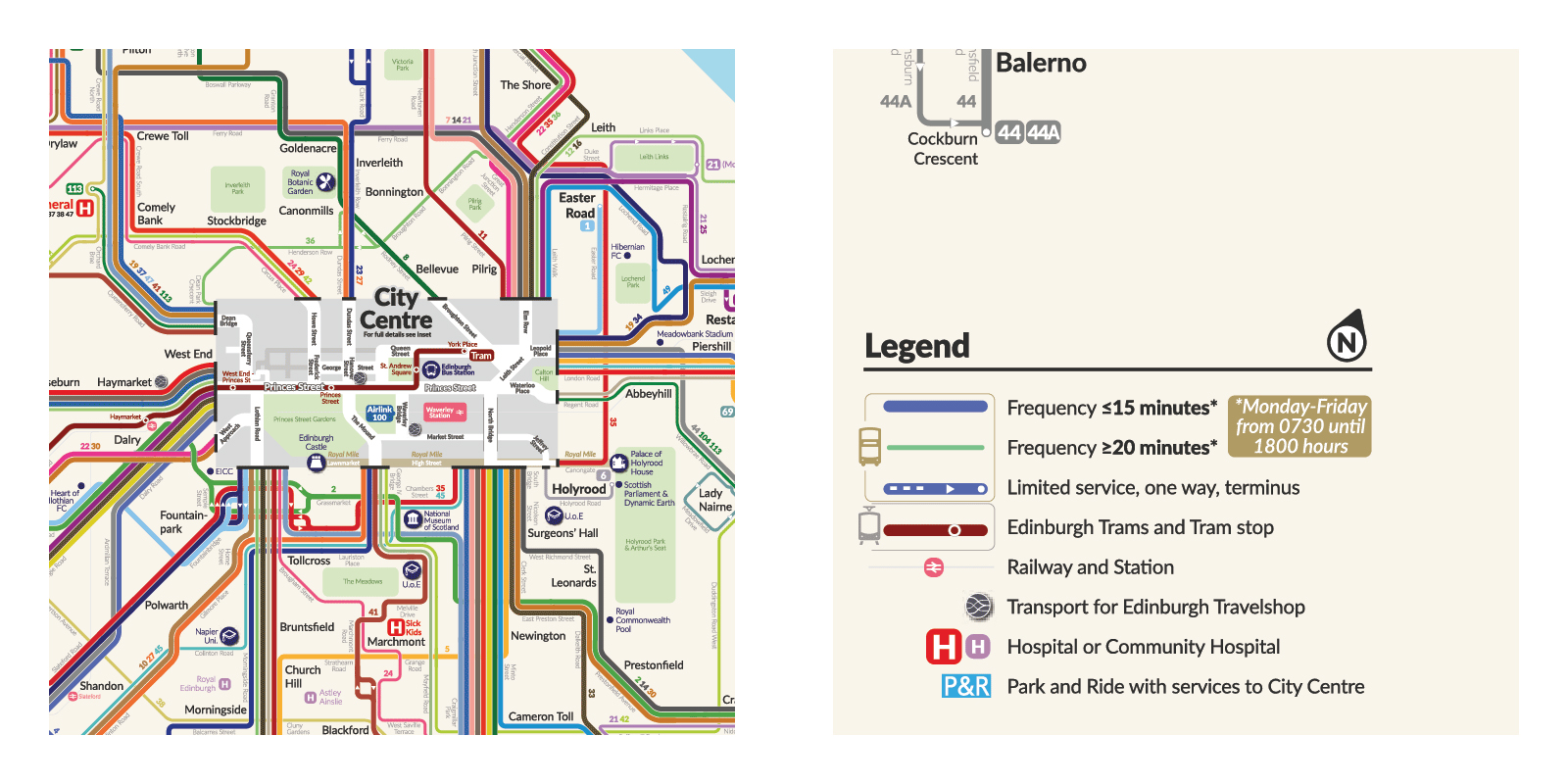
Frequency map: Edinburgh
France: Amiens, Bordeaux, Dijon, Grenoble, Lyon, Metz, Orléans, Reims, Toulon
France has enthusiastically embraced frequency maps, with numerous examples of both the geographic and schematic types. Most cities even publish maps of both types. The maps are comprehensive, with all necessary information about stops, routes and line types, sometimes even a bit too much, overwhelming the user with information.
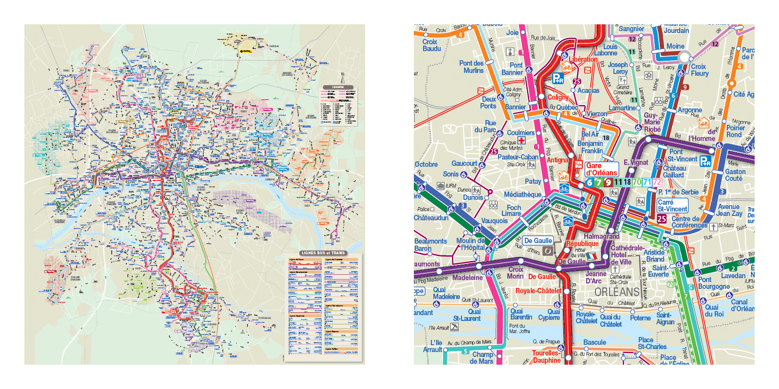
Frequency geographic: Orléans
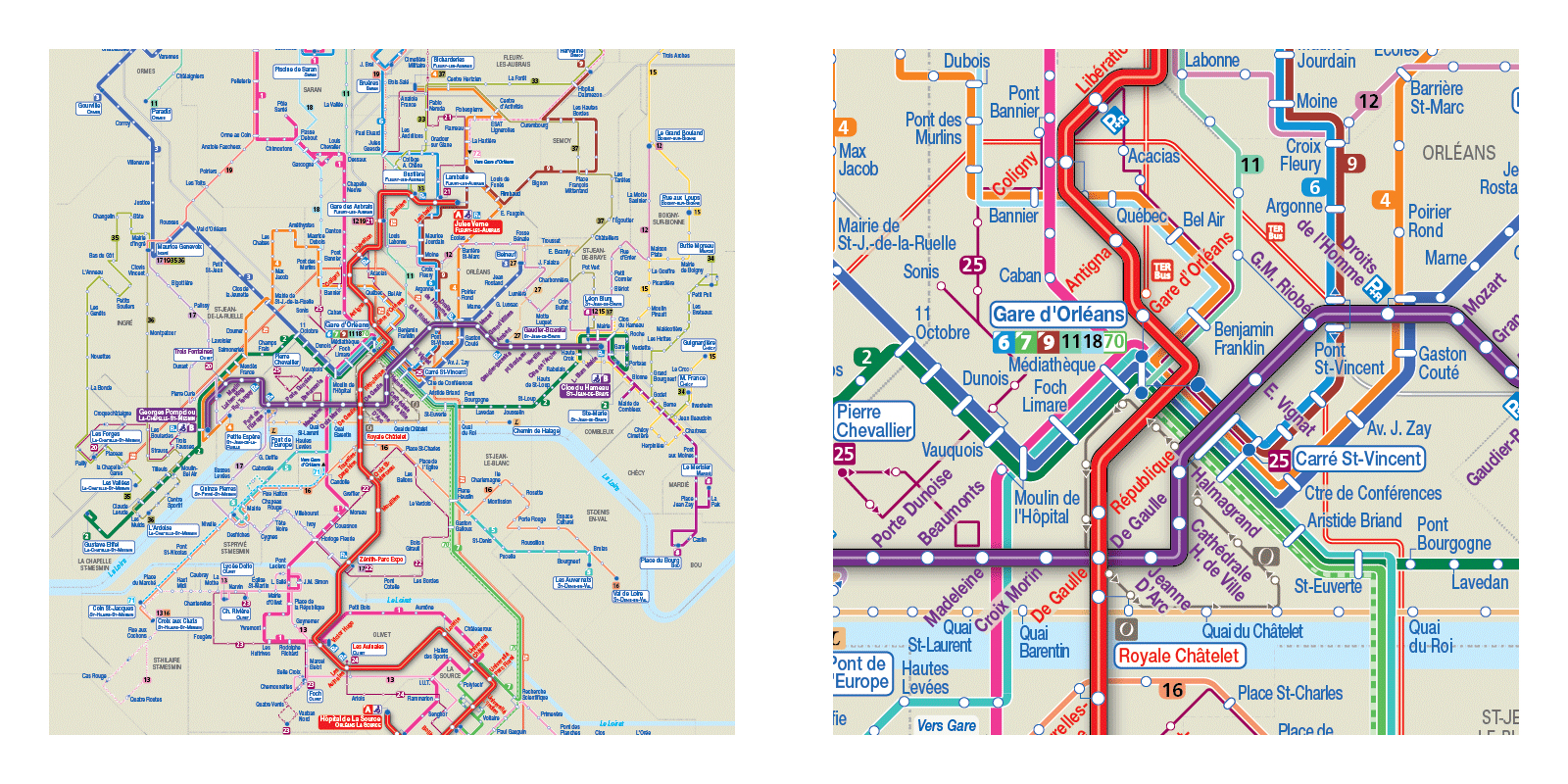
Frequency schematic: Orléans
Germany: Aachen, Braunschweig, Chemnitz, Dresden, Leipzig, Magdeburg, Osnbrück, Rostock
One of the best European Frequency maps is in Leipzig. Lines are singled out, a color is attributed to each of them and frequency is shown with a difference in width. But most of all, lines and colors are organized in a way that shows how the system really functions. The layout is focused on the centrally located circular loop surrounding the old town and all lines serving this area are color coded according to their common routes. This makes the network intuitive and unambiguous for the map reader.
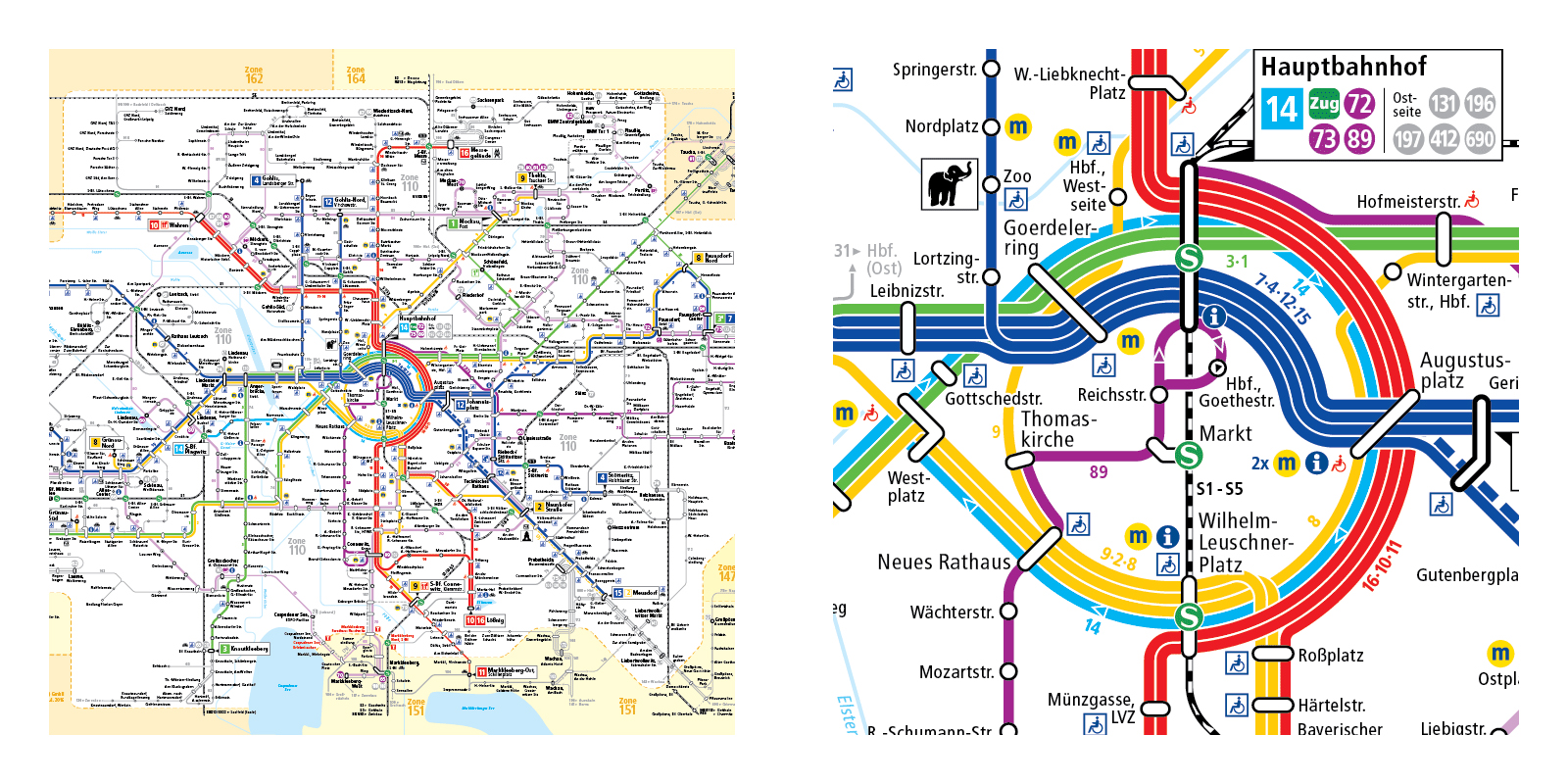
Frequency map: Leipzig
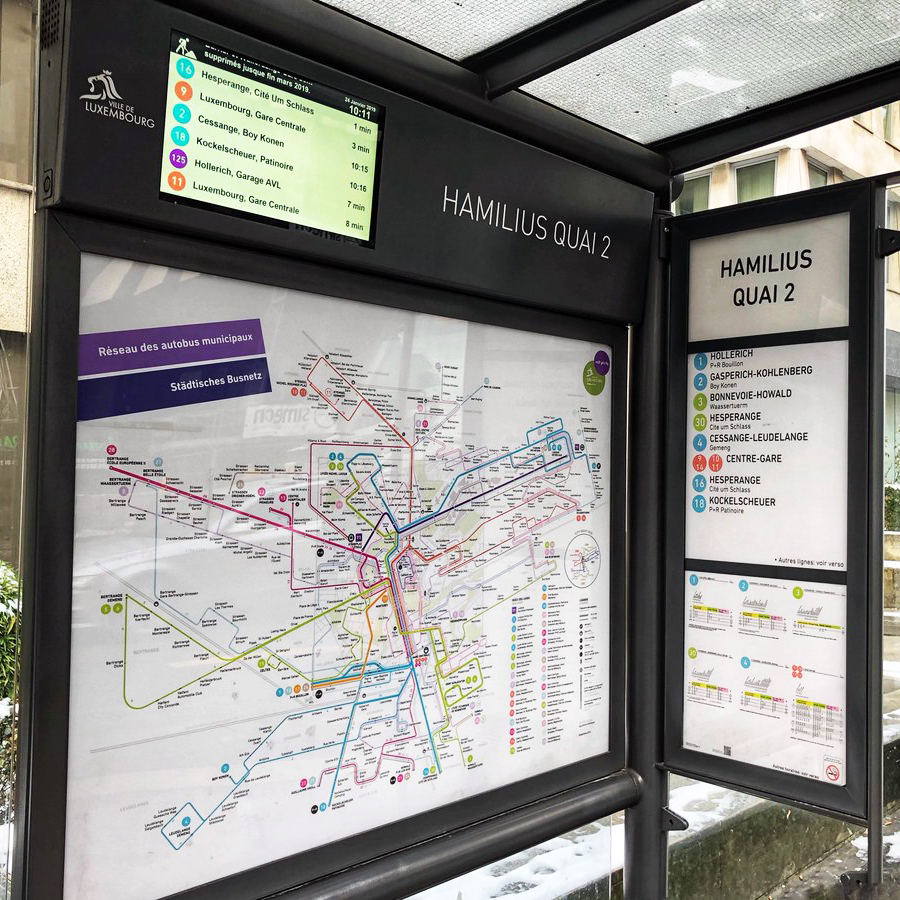
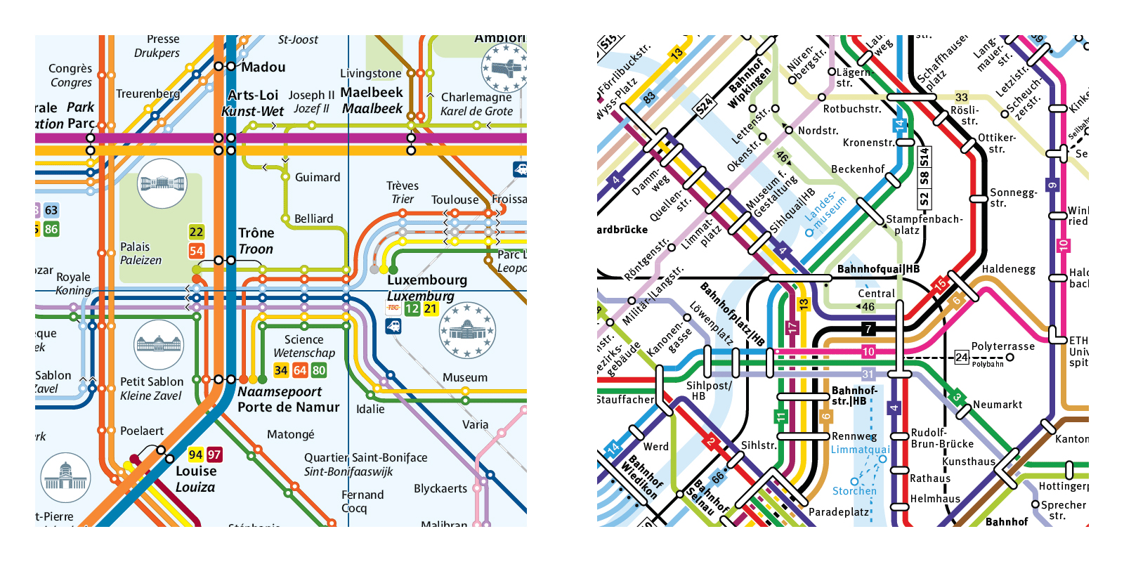
Benelux: Luxembourg, Utrecht
Here, I must inform the reader that I am the designer of the new official maps of Luxembourg and Utrecht. These are frequency maps in full, with additional improvements in line grouping, symbolism and combined scales. Here in the thinking that led to these designs.
Line grouping
When two or more less-frequent lines share a long common route and when their timetables are synchronized, their frequencies add up and this common trunk route effectively becomes a single high frequency line. These lines are grouped on the map and assigned the same color; the trunk part is a thick line with thinner branches at each end. Lines are also color-coded and grouped according to their functions.
In Luxembourg, on the central corridor where more than 15 lines share the same street, lines are grouped by directions, forming only 5 thick trunk lines thus simplifying readability.
In Utrecht bus lines are grouped in 5 categories for legibility (terminal in the center, thru lines, university, tangent, local) and other transport modes have their own color (train, tramway). Line grouping is a way to simplify the network and intuitively convey its organization to the traveler.
Symbolism
Symbolic elements are highlighted in order to ease orientation and conform the map to the mental image of the city people may have.
In Luxembourg, the old fortress town, placed in the center of the map, is roughly pentagonal in shape and commands the angles at which avenues radiate from it. All line segments on the map are multiples of 18° as it allows for both orthogonal (18° x 5 = 90°) and pentagonal based (72°) axis.
In Utrecht the main landscape marker, apart from the old town, is the rail line cutting through the city at a roughly 60° angle. A 30°- 60°- 90° angle pattern fits the street grid and overall layout marvelously.
Combined Scales
In both cities the network is very dense in the city center and sparser in the periphery. The city center is also the area where most pedestrian connections between lines are located. The map has to show two very different scales: the city center where walking distance is important, and the periphery which has fewer connections and can be simplified and distorted. Therefore on both maps the city center is enlarged and geographically accurate, streets and remarkable buildings foster orientation and enable pedestrian connections, while the periphery is shrunk and schematized while remaining topologically accurate.
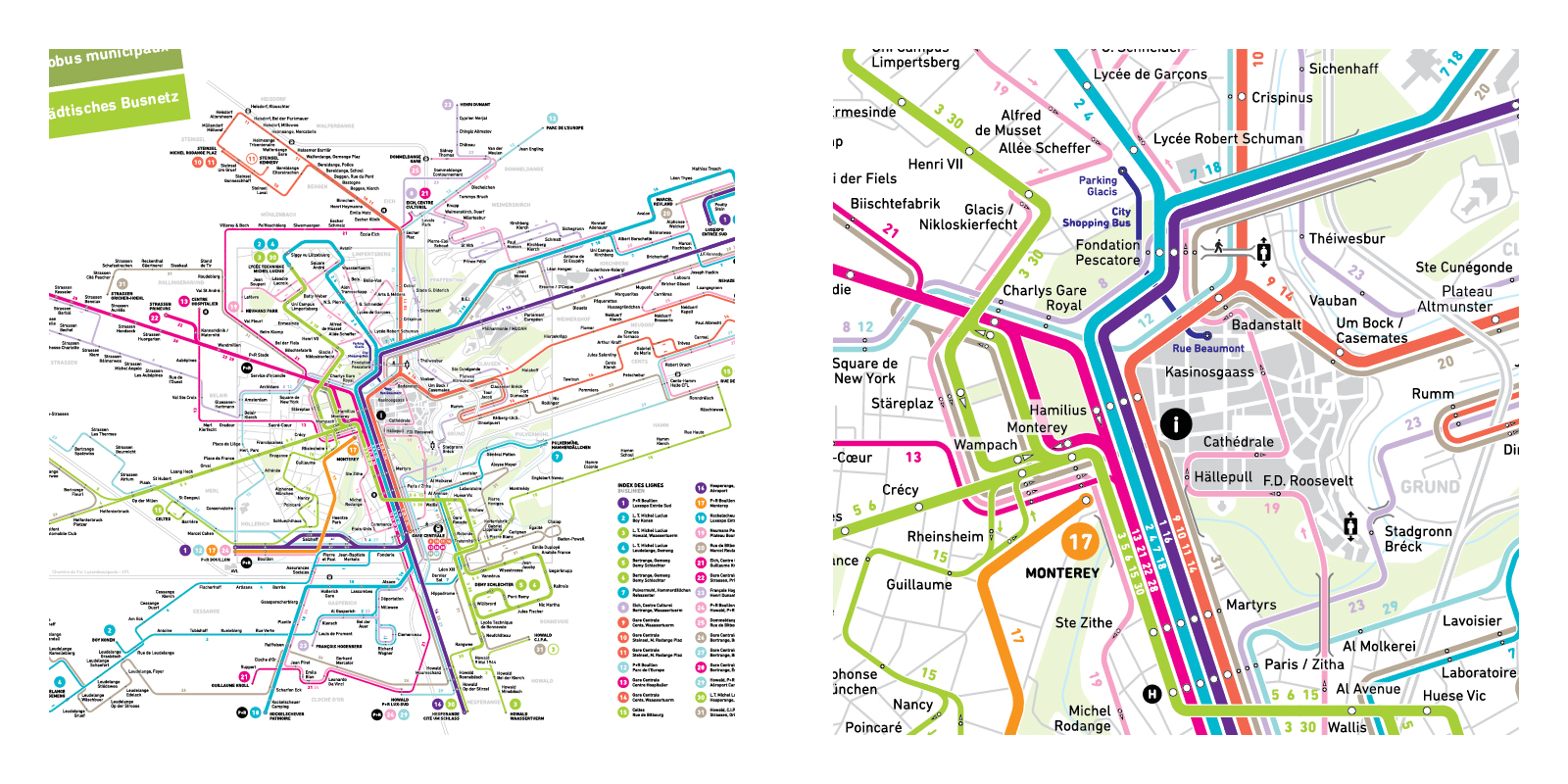
Frequency map: Luxembourg
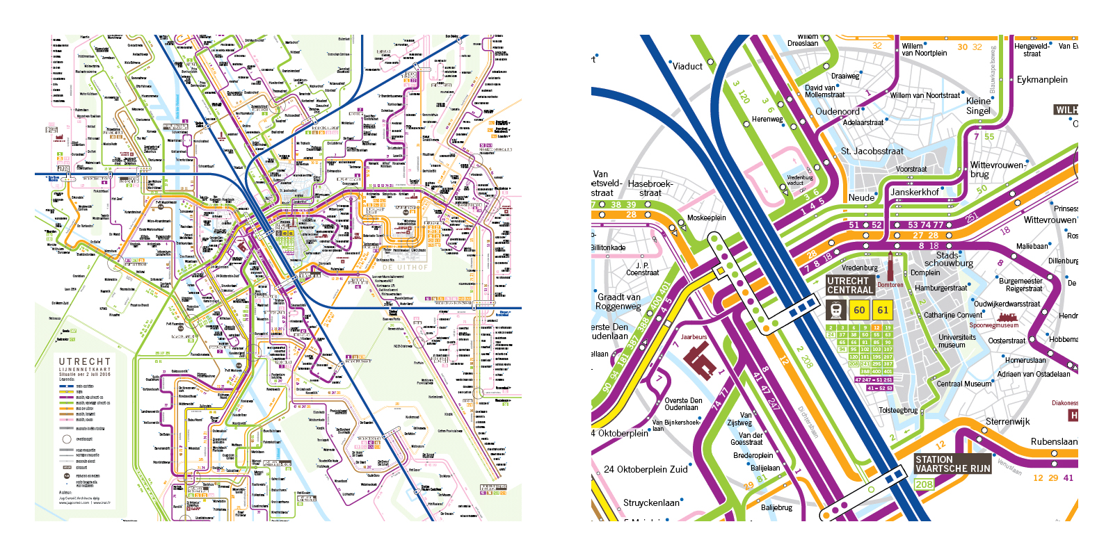
Frequency map: Utrecht
As these examples show us, European bus maps are witnessing an exciting new era of creativity and bus networks will benefit hugely from this improvement in representation, with maps that allow them to be perceived as comprehensive transport networks in their own right and not mere collections of independent lines.